25/11/2024
The ISType 2024 conference, themed “text-ure,” took place on Saturday, November 2nd at Salt Galata, Istanbul, and brought together a distinguished lineup of speakers to explore the evolving dimensions of type design. The event, which addressed historical influences, contemporary innovations, and forward-looking perspectives, provided attendees with a comprehensive perspective on how type and texture intersect in today’s design environment.
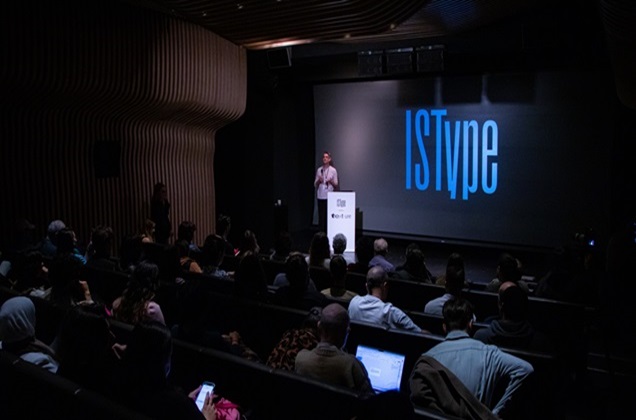
The conference began with an opening speech by ISType co-founder and director Onur Yazıcıgil, who reflected on the conference’s development and impact over the past decade. Yazıcıgil explained how Istype, which began in 2011 at Minerva Han in Karaköy, has grown and expanded its scope each year, and underlined the importance the event places on its interaction with cultural disciplines.
The first guest speaker, renowned font designer Tobias Frere-Jones, shared “lessons learned” from his extensive career. Frere-Jones recounted his journey from his early days as a high school student fascinated by letterforms to his current status as an industry-leading designer. Frere-Jones’ stories provided an inspiring glimpse into the challenges and breakthroughs that shaped his path.
Ulrike Rausch then captivated the audience with her presentation that combined traditional handwriting techniques with modern software tools. She demonstrated how she combines OpenType programming with the latest font technologies to produce refined handwritten fonts that bring digital type to life with a handmade touch.
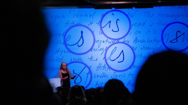
Another colorful and lively presentation of the day was by Marc Schütz, Creative Director of Studio Schultzschultz. Marc Schütz showcased his studio’s experimental approach, the innovative use of specialized digital tools that bridge the gap between type design, typography, and creative coding, and showcased new perspectives that explore the boundaries of digital and physical typographic expression.
Following Marc Schütz, award-winning creative director Astrid Stavro examined the powerful relationship between type and image. Stavro emphasized typography’s ability to shape visual narratives and convey meaning beyond words, underscoring the transformative potential of type in branding and storytelling.
The conference continued with Eben Sorkin’s reflections on “a typographer’s view of optical size.” Known for co-designing the Merriweather typeface family and the YouTube logo font, Sorkin discussed the impact of choosing the right font size on readability and visual harmony. Using real-world examples, he demonstrated how optical sizing can enhance the reading experience and overall aesthetic.
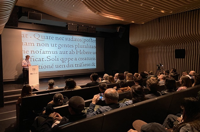
Interdisciplinary Contribution
The second part of the conference, held in the afternoon, began with the presentation of Bartu Başaran, who is currently pursuing his master's degree at Sabancı University, on his research entitled ‘Monumental Inscriptions of Perge - Revival of Greek Letters’. Başaran, who specializes in multi-letter typefaces, shared his adventure in reviving historical Greek inscriptions in Perge under the supervision of Onur Yazıcıgil. Başaran's project aimed to bring these ancient letter forms to modern use and to bridge the gap between history and contemporary type design.
After Başaran, Albert-Jan Pool, designer of the iconic FF DIN typeface, took the floor. Jan Pool gave a speech entitled ‘Coincidence in Typeface Design’ and explained how chance encounters and unexpected opportunities influenced his career. Pool's journey opened a window into interesting methods that could lead to iconic typefaces such as FF DIN, which are now widely used around the world.
Following Albert-Jan Pool, type designer and typographer Kostas Bartsokas took the stage. Bartsokas, who has received numerous awards in his field, examined the topic of ‘type across dimensions’ and analyzed how the textural qualities of type change when moving from small to large screen formats. Bartsokas, who specializes in Latin, Greek, and Cyrillic alphabets, provided valuable insights into the complexity of type design that maintains consistency and integrity across a variety of applications.
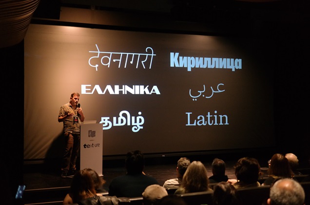
The conference concluded with an impressive presentation by Studio Dumbar/DEPT® Creative Director Liza Enebeis entitled ‘Textures in Sound and Movement’. Enebeis showcased her innovative work on brand projects such as the North Sea Jazz Festival, Utah Jazz Basketball team, Instagram movement identity and D&AD Creativity Festival. Her impressive presentations on sound, movement, and texture underlined the limitless potential of typography and design to create immersive brand experiences by exploring the boundaries of experimentation, behavior, tools, materials, and collaboration to define the essence of an identity.
The conference concluded with a presentation and speech prepared by Linguist Thomas Milo to commemorate Pim Rietbroek, the famous editor-in-chief of the Dutch publishing house Brill, who passed away in 2024.
The ISType 2024 "text-ure" conference provided a thought-provoking experience on how typography shapes and is affected by the textures of our visual and tactile experiences. All participants had the opportunity to gain new insights and meet with sources of inspiration that will redefine the potential possibilities that emerge with the influence of different disciplines in the field of typographic design.
Credits: Rasim Gara & Tuğrul Günaydın


